Established in 1995, Valhöll is a well-respected real estate agency with a long-standing reputation for excellence. Since its inception, Valhöll has been a consistently well-run agency, building a strong and trusted foundation in the property market.
More recently, Valhöll entered an exciting new chapter under new ownership. To mark this evolution and signal their forward-looking vision, the agency partnered with hellogoodbye to design a new logo and visual identity.
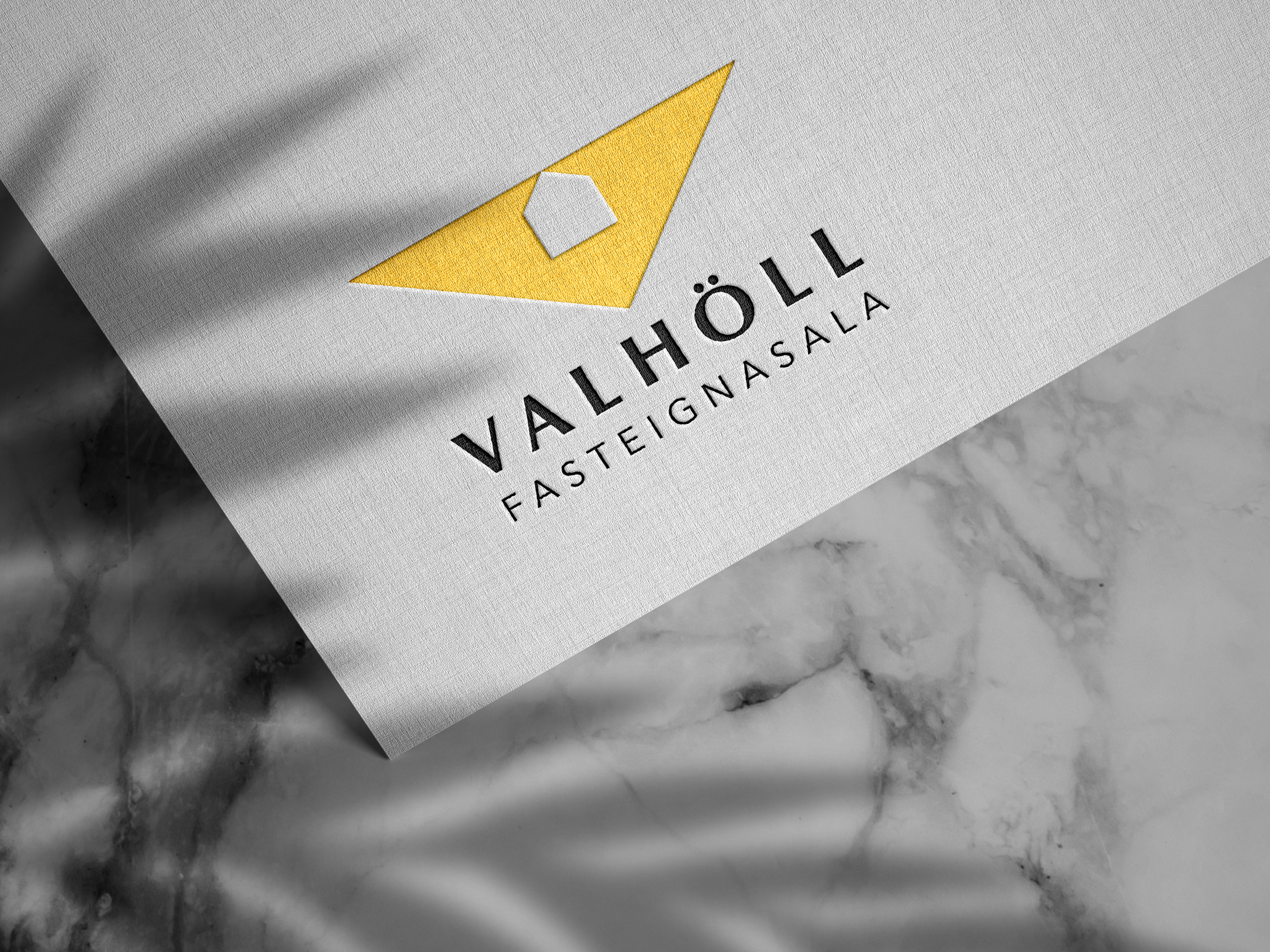
While Valhöll possessed a strong reputation, its existing visual identity faced a few challenges. The previous logo, though familiar, was outdated and blended in within a crowded Icelandic real estate market where many agencies shared similar visuals. This made it difficult for Valhöll to stand out and distinctly communicate its unique positioning.
Furthermore, a notable disconnect existed between the agency’s evocative name, “Valhöll” (Valhalla), rooted in rich Norse mythology, and the logo’s visual reference to a Greek temple. Finally, on a practical design level, the kerning between letters, like “V” and “A”, was off and the letter “Ö” appeared constrained by its proximity to the roof element of the logo.
These factors combined presented a clear opportunity to develop a new visual identity that would be more distinctive, conceptually aligned, and visually refined.
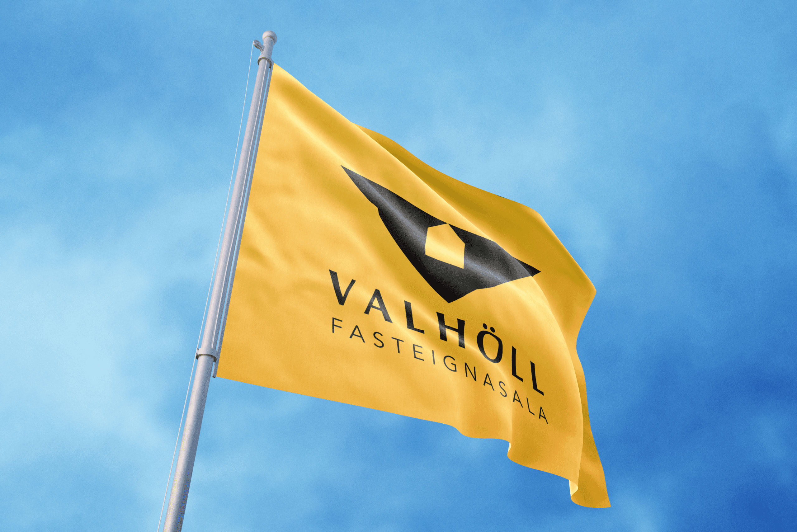
The new logo for Valhöll was designed to be both modern and deeply symbolic, directly addressing the challenges of the previous identity while forging a distinctive path.
A key element from the old logo, the triangular roof, was thoughtfully re-envisioned. By inverting this triangle, we crafted a strong, majestic letter “V.” This “V” stands as a bold monogram for Valhöll and evokes a sense of regality, directly connecting with the grandeur of “Valhalla” from Old Norse mythology. The internal negative space within this royal “V” subtly outlines the essential form of a house, grounding the identity firmly within the real estate sector.

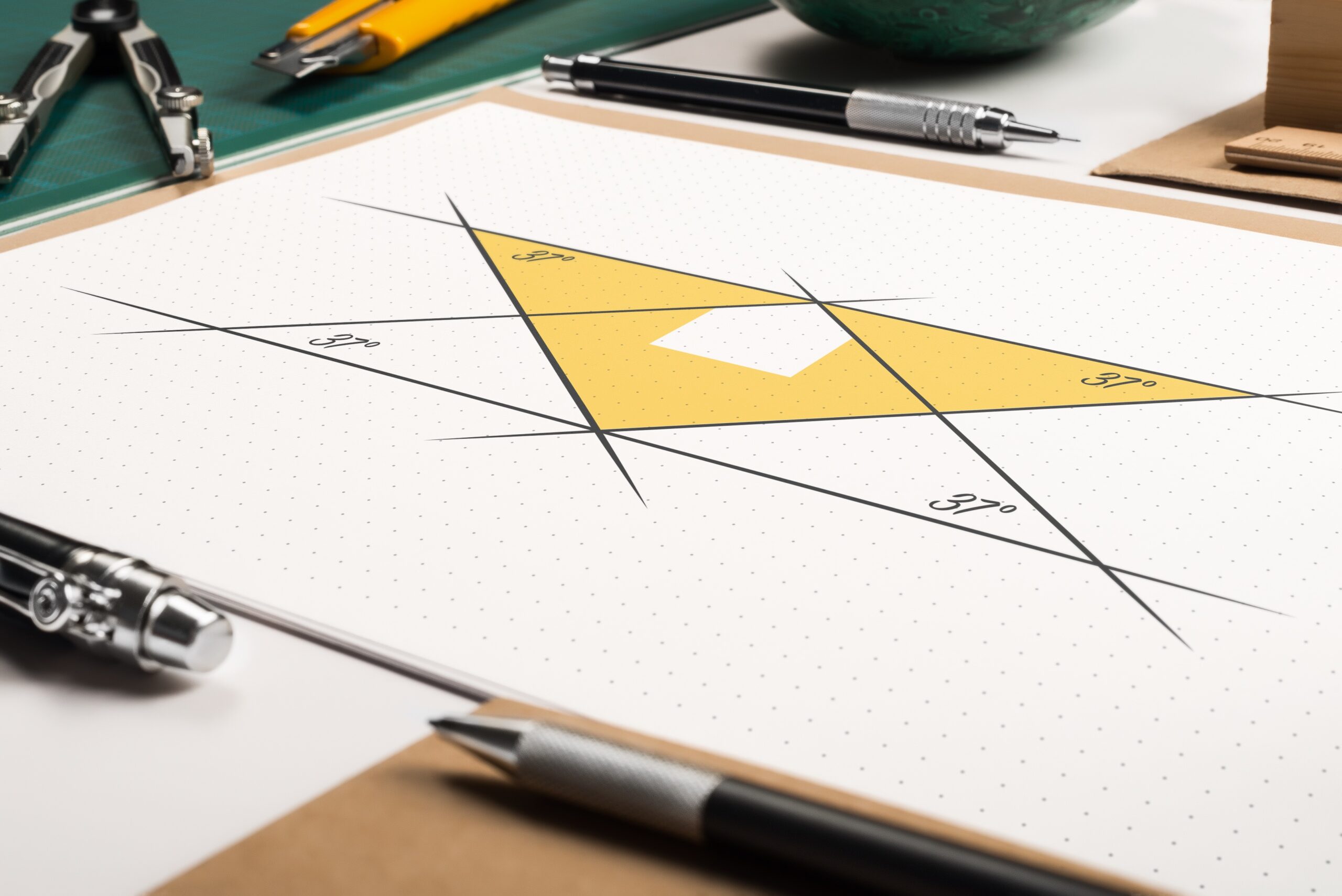
To firmly root the design in it’s icelandic setting and further embedding a nod to the agency’s Nordic namesake, the incline of both the “V” itself and the roofline of the house silhouette within it is set at 37 degrees. This specific angle is a common architectural feature on roofs in Northern Scandinavia, designed to efficiently manage heavy snowfall, adding a layer of considered, authentic detail to Valhöll’s new mark. The result is a logo that is unique, conceptually rich, and reflective of Valhöll’s ambition and heritage.

“Hello Goodbye showed tremendous initiative and far exceeded our expectations in their work and professionalism. Their design is consistently clever, forward-thinking, and demonstrates a deep understanding of what we are looking for. I cannot recommend Hello Goodbye highly enough.”
