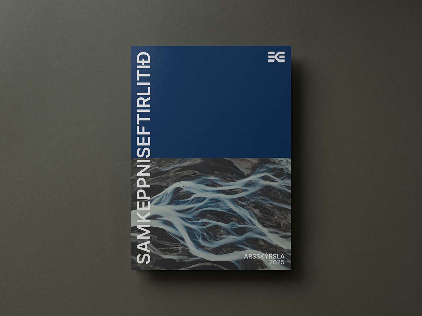
Samkeppniseftirlitið (The Icelandic Competition Authority) is Iceland’s independent regulatory body tasked with promoting and safeguarding effective competition in the economy. Established under the Competition Act in 2005, it enforces national competition law as well as relevant provisions of the European Economic Area (EEA) Agreement, ensuring free and fair market activity across all sectors of business in Iceland.

The existing logo was built as a monogram using the letters SE for Samkeppniseftirlitið, but it lacked visual unity. The “S” and “E” were drawn in entirely different styles, making the mark feel more like two separate logos than a single, cohesive identity. Proportions were inconsistent, and the logo performed poorly at smaller sizes, limiting its usability across digital and official applications.
In addition, the flowing, lightweight form of the “S” conflicted with the Authority’s role as a strong regulatory body with formal oversight and the power to impose sanctions and fines. Compounding this, the institution had naturally come to be referred to as SKE in everyday use, creating a disconnect between how the organization was known and how it was visually represented. The challenge was to resolve these issues while redefining the monogram to reflect both authority and clarity.
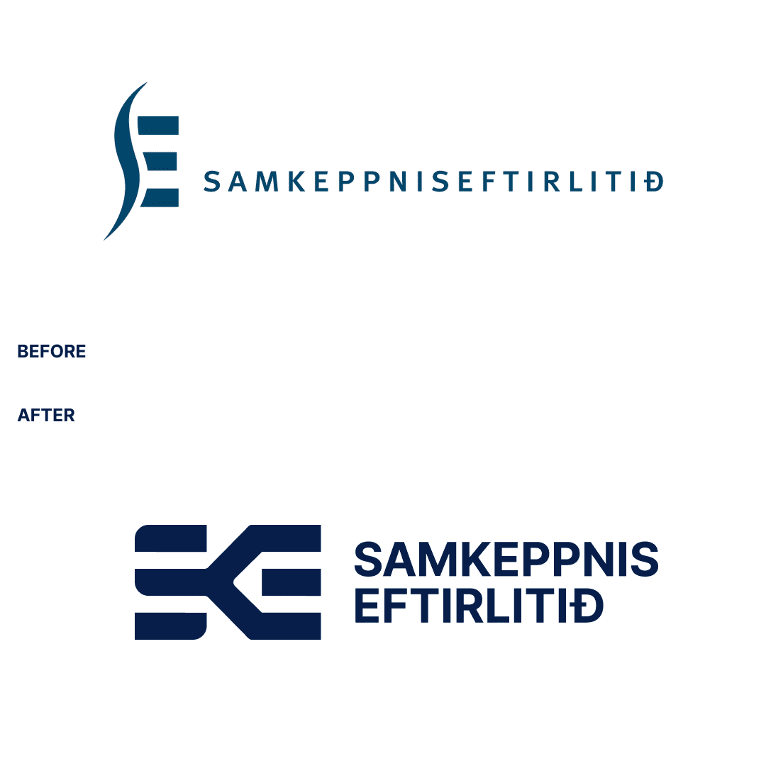

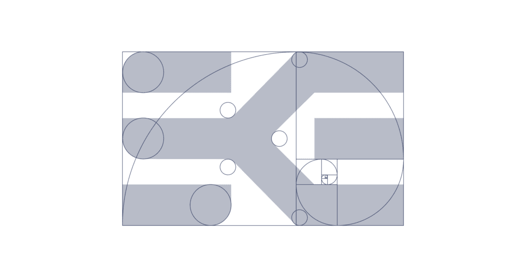
The result is a strong, confident symbol with visual weight to match the Authority’s role and mandate. The mark draws directly from the previous logo—specifically the structure of the original “E”—ensuring continuity while establishing a clearer and more authoritative presence. Proportions are based on the golden ratio, grounding the symbol in timeless, universally recognizable principles of balance and order.
The core the symbol is a single continuous line that begins as an “S,” splits into two lines to form a “K,” and resolves as the top and bottom strokes of the “E.” This visual progression represents the flow of markets and the transition from restricted to active competition—from monopoly to choice, and from limited market access to open participation.
The official color was refined into a darker, richer navy, reinforcing the Authority’s credibility and formality while providing a more appropriate, institutional tone across both digital and official applications. Inspired by the principle that one is a monopoly, two is competition, the mark captures the essence of Samkeppniseftirlitið’s purpose in a clear and enduring form.